Press, communication, corporate identity
Press requests for the HandbikeBattle go through communicatie@handbikebattle.nl.
Corporate
- Two Capitals; we write both the H and the second B with a Capital Letter. We leave the of the way, except in a Dutch or English sense.
- The name should be under the logo. An exception is the title on the organization’s website and banners.
Font
The font of the HandbikeBattle is Agency FB. It’s going to be used for titles and cups. In addition for short texts of one sentence, such as slogans or indications. For other texts and explanations we use arial.
Logo and
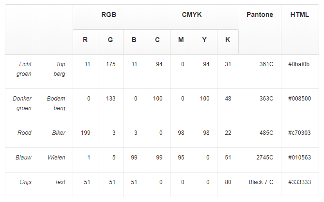
colour usage![]() The Basis of the website is linked to the colors of the logo. Below is the five colors we use in the logo. Here you can download the handbikeBattle logo.
The Basis of the website is linked to the colors of the logo. Below is the five colors we use in the logo. Here you can download the handbikeBattle logo.